
ASL Print FX’s Coronavirus Statement
March 25, 2020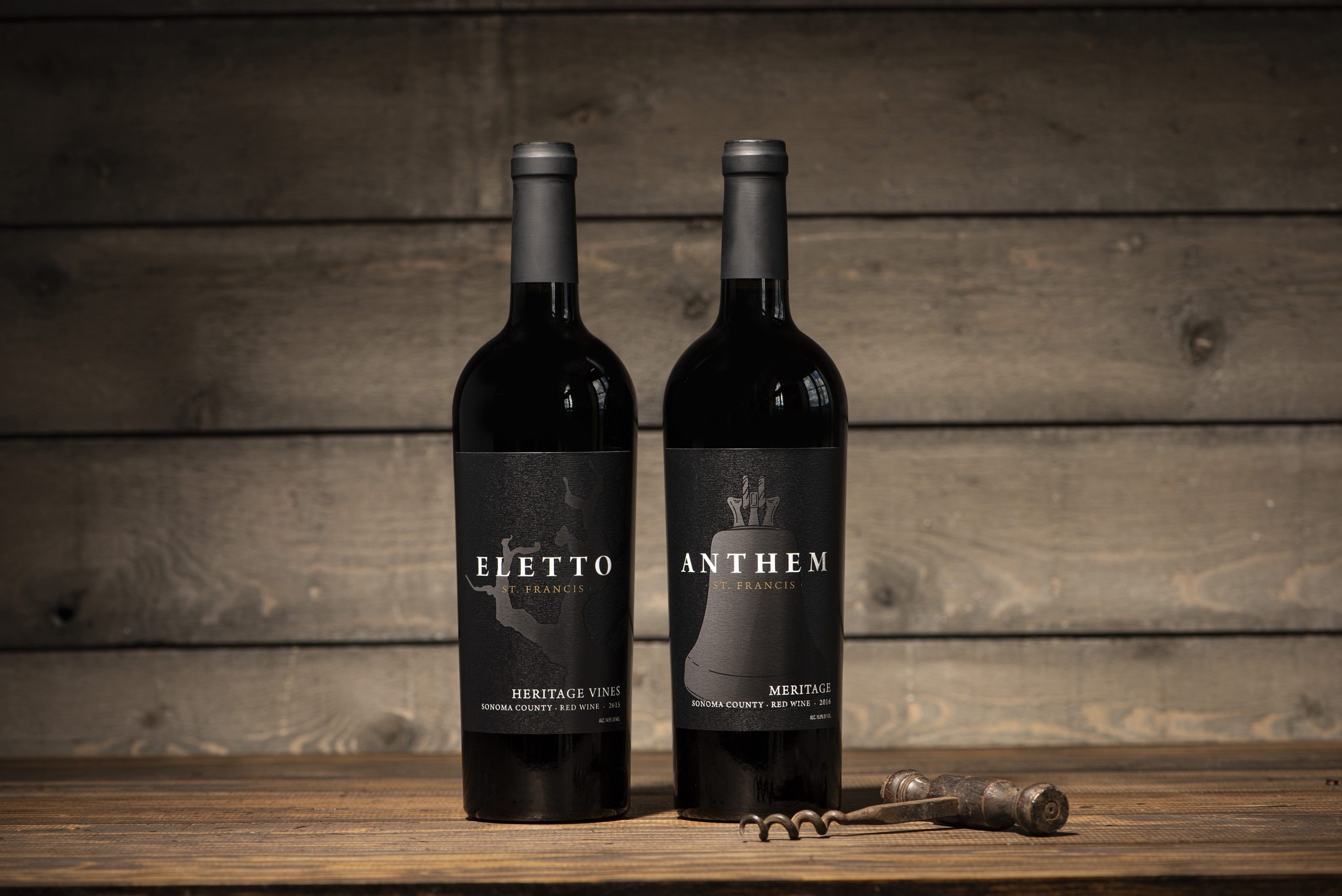
WE BUILD RELATIONSHIPS – ST. FRANCIS VINEYARD & WINERY
July 7, 2020
#1: The Role of the Label When Building a Brand
When we think of beverage packaging, we think immediately of the label design. But, do we think of the role of the printing process in bringing the intent of the design to life? In terms of shelf presence, a label with a little added foil stamping, embossing, or a beautiful paper can greatly elevate the brand. The paper and colors we choose, along with the embellishments, are as important as the design itself. Finding a printer who is willing to be a creative collaborator, a printer willing to spend the time understanding the overall goal of the label, and what it signals about the brand is integral to executing a product that fits the designer’s vision.

Beyond aesthetics, the label needs to work in the environment it’s designed for. Will it stand out on shelf? Will it pop on a two-dimensional e-commerce page? Should the paper withstand refrigeration? Should it be scuff-tested to withstand shipping? The label should also fit the shape of the bottle perfectly to avoid complications during bottling and application. All these details can make or break a good design.

Charbay Vodka uses beautiful, bright bold colors to differentiate the flavors. Being a vodka, the label needs to hold up in the fridge or freezer. ASL, 4Parts Design and Charbay Distillery narrowed paper choices down to wet strength options. The client wanted a little bit of texture so we chose a bright white felt paper. ASL suggested adding a spot gloss to the logo and emblem to give it a little “pop” when the light hits it. Each year the color is matched to the previous run for consistency and an overall striking package that embodies Charbay’s brand image.
#2: How a Beautiful Print Job can Elevate a Brand.
Does paying attention to the printing details REALLY make that much of a difference? Simply put, yes!
Here’s an example of my finished design for Domaine De La Riviere. Digitally, it looks a little flat and not at all high-end enough for the price point and quality of the Domaine De La Riviere brand. I had some ideas of what embellishments I wanted to add, at the printing stage, to elevate the brand, but it was tough for the client to visualize it.

I discussed my predicament with ASL. They looked at my art, made a few suggestions, and then worked with their Prototyping FX technology to convey the texture, colors, and foils that the final product would have. Now the client didn’t need to visualize the final label, they had a near final label in their hands. Also, consider prototyping for when a press check is out of the question (which seems to be the case more and more these days.) The final labels are so beautiful and have been consistent every year on out.
#3: The designer / printer relationship
There is nothing more important than good customer service. I specialize in design and branding, but essentially I am in the customer service industry. I am always available by phone and e-mail and respond within hours of all questions.
Designing a brand is daunting. Coming up with a brand name in and of itself is tough. Then jumping through the TTB hoops, figuring out the essence of the brand, the story you want to tell, finally designing the label, and THEN thinking about all the little details of printing?
Jumping into the design process and building a new brand can be overwhelming. I like to put my client’s mind at ease as much as possible. And, I expect the printer I work with to do the same – put my mind at ease, as well as my client’s.
It’s not only important to have a creative dialogue about our goal for the printed piece, but to be able to ask questions, and learn about new techniques that could help elevate the design. Often, the printer will suggest things I hadn’t thought of. When my design is done, it is the printer’s job to bring the vision to life. Without a close working relationship, this couldn’t happen. I consider my printer my creative partner. Together we make sure we achieve a beautiful package. Here are just some things I discuss with my printer before going to press.

- Label size: Does the die line need to be tapered to fit the glass? Should the size be adjusted for a burgundy bottle?
- Paper type: Felt? Texture or no texture? Wet Strength? Gloss or matte?
- Embellishments: Foil stamping, embossing, debossing or sculpted emboss? High build, spot gloss, sequential numbering, overprinting, etc.
- Type of printing: Digital, flexo, offset.
- Re-wind direction: How the labels need to be wound to work on the bottling line.
These terms can be confusing to begin with, but having a printer that thinks about all the elements and asks the right questions will make the process infinitely smoother. It truly takes a team to create a beautiful brand.
To learn more about ASL Print FX Napa and see a list of Clients we have worked with click here.